Table of Contents
Date: 2020
I helped HEAR360 develop and design Orbit plugin. My role on this project was UX/UI design. Everything you see here was designed, illsutrated, and prototyped by me.
What is the Orbit plugin? 💫
Orbit allows a user mixing in a surround sound format to rotate the image of their mix or of a surround sound bed. The multichannel audio component of the mix that is. By doing that they can hear it from different perspectives and angles using the large rotation knob at the top. Available as VST, AAX, and AU plugin.
Surround research
At first, I made sure to learn about surround sound as much as time permitted. So, I researched everything from books on the topic, competition, and general practices in design in similar type of software applications.
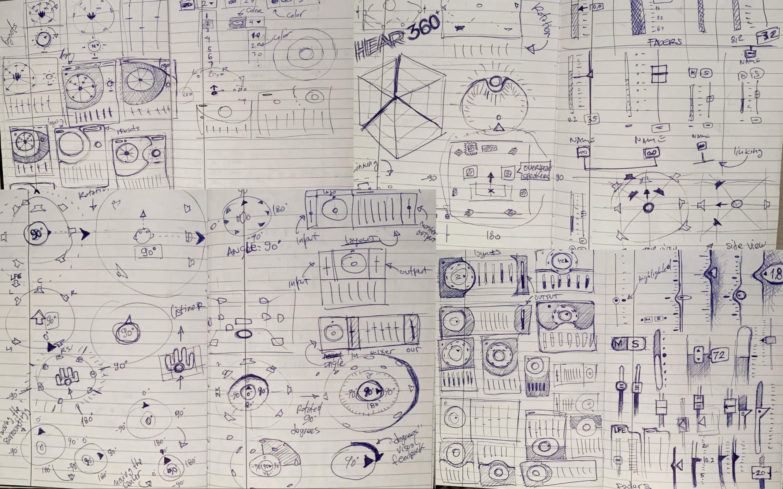
Sketching on paper
As usual, I start on paper. 📝 I love it because it is the fastest way in translating ideas from mind to reality. It’s oh so tempting to start on screen, but the paper is the best way to explore and materialize ideas.
Plugin interface design
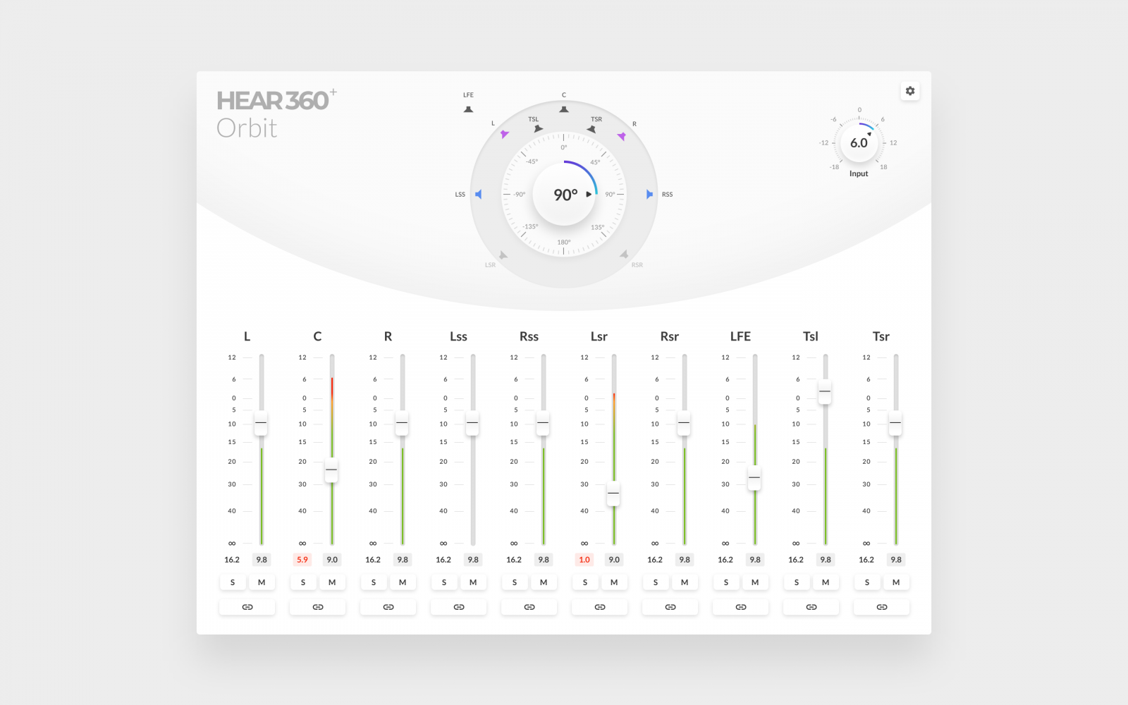
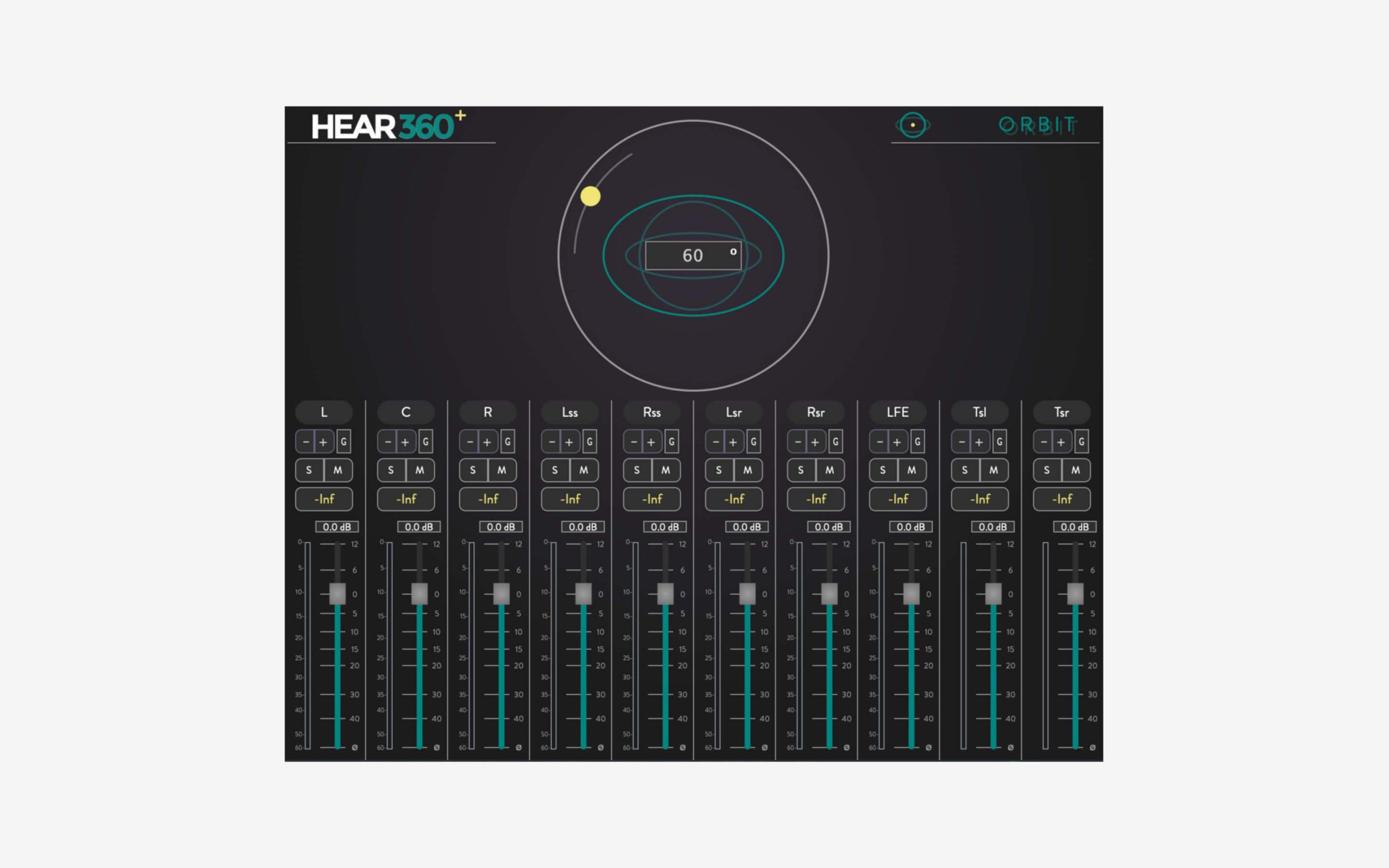
This is where it started, this was the initial state of the plugin (shown below). Actually, there are a couple of plugins but they are pretty much the same except for the number of channels. So for the sake of this case study, I’ll focus here only on the most robust one with 10 channels.
Besides visual design (style, type, colors, etc), I defined a few other UX related improvements. For example:
- Make the function of the rotation knob more clear. Show additional helpful information if possible.
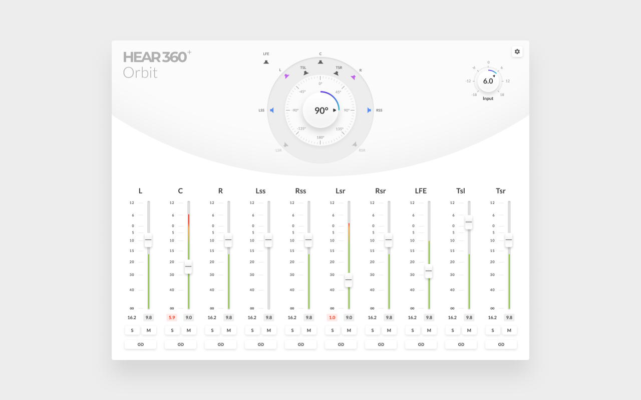
- Show visual feedback on which channels are used, muted, soloed, grouped, or clipping.
- Make channel grouping intuitive.
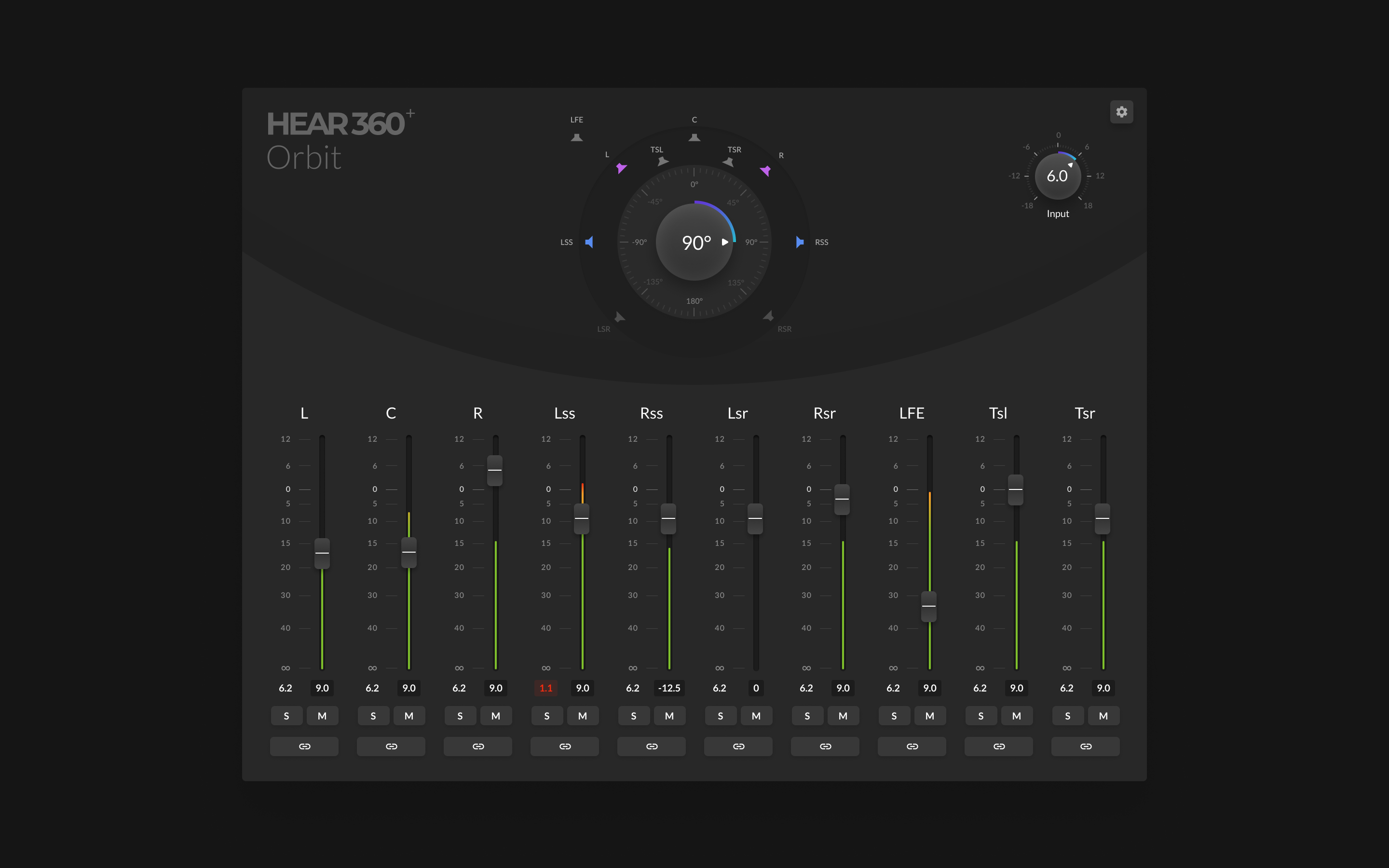
- Enable users to choose the light or dark theme, update the plugin, etc.
- Add master trim input level knob control.
- Simplify the branding (company logo and plugin name).
- Make metering of the incoming levels more clear.
- Explore different layout options. Make it possible for the user to choose between horizontal and vertical layouts.
- Etc.
Faders
Exploring the faders was the first thing on the list. 🎚 Because they are the biggest part of this plugin. Faders take the center stage alongside the big rotation knob at the top.
As with all my designs, I try hard to keep things simple. But with a magic touch of liveliness and a bit of character for a good measure. Also, I’m still keeping the spirit of pen and paper here. First, let the creativity flow uninterrupted, and then later cut the fat. 🪚
Orbit plugin knob
I had two ideas for the orbit knob. One was to show a user sitting in the middle. The second idea was a bit simpler. It was about showing only the information about a degree of speakers’ rotation. Adjusting the knob will rotate the speakers around the user indicating the sound perspective.
Besides the image rotation, orbit displays muting and grouping of the surround speakers. Indicating this to the user is very useful. Giving feedback like this is always welcomed in my book.
UI Layout exploration
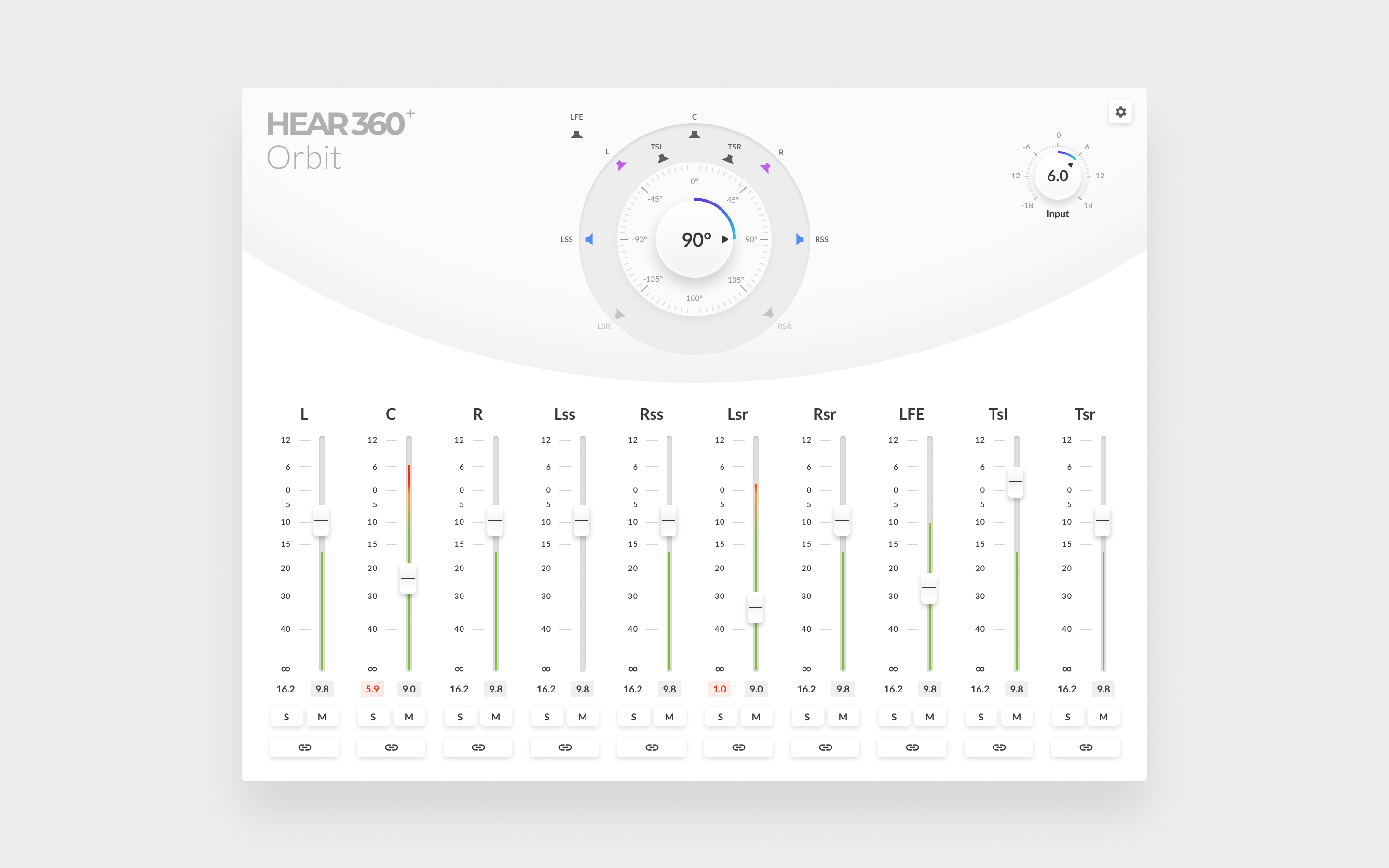
This composition, or should I say layout, paved the way for the final interface design.
After receiving approval for my initial UI design from the stakeholders, I’ve once again continued exploring and fine-tuning. Type, color, layout, making sure things are consistent, creating light and dark themes, fixing technical stuff, etc. All that good interface stuff. Here are some design mockups for your viewing pleasure. Enjoy. ✨
You can check out Orbit plugin and UpMix on The Department Of Sound website.
If you need help designing interfaces (especially audio and music interfaces) hit me up! Let’s change the world! 💪
